Showing posts with label SQL Server Reporting Service. Show all posts

Saturday, November 30, 2013

Dynamic cell formatting in SSRS

This post is about, how to change cell formatting dynamically in reports. Even though there is no any particular property, this can be done using “Conditional Formatting”.


The Iif function returns one of two values depending on whether the expression is true or not. The following expression uses the Iif function to return a Boolean value of True if the length of Description not exceeds 50. Otherwise it returns False. If function rerun true then font size will be 10pt, else 8pt.
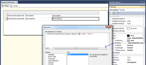
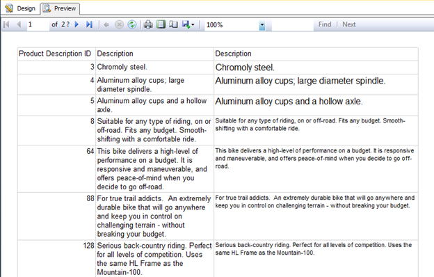


A different way to get the same functionality uses the Switch function. The Switch function is useful when you have three or more conditions to test. The Switch function returns the value associated with the first expression in a series that evaluates to true.

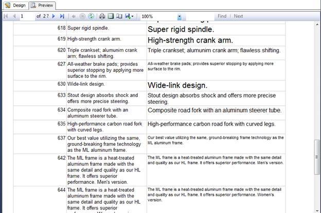


In the above example I have shown only formatting the font size, the same formatting expression can be applied for color changing, font style and many more.


Cheers!


Tuesday, November 5, 2013

Some useful tips for Pie Chart in SSRS

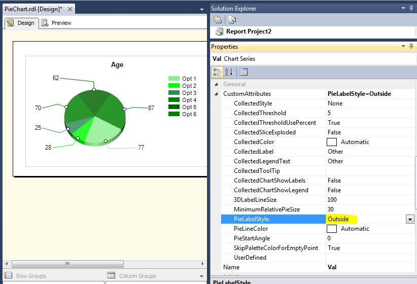
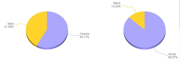
Tips 1: Show the labels outside the pie chart

By default label shows as below:


Change CustomAttributes “ PieLabelStyle” as “Outside”


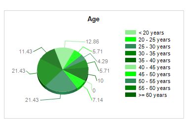
Tips 2 : Display label in the meaningful way
Delete the label set and click on the label expression and type custom code as want.
Here in first line show the Lable Name and the second line the % Value:
=”#LEGENDTEXT” & vbcrlf &
Field!Val.Value & “ %”


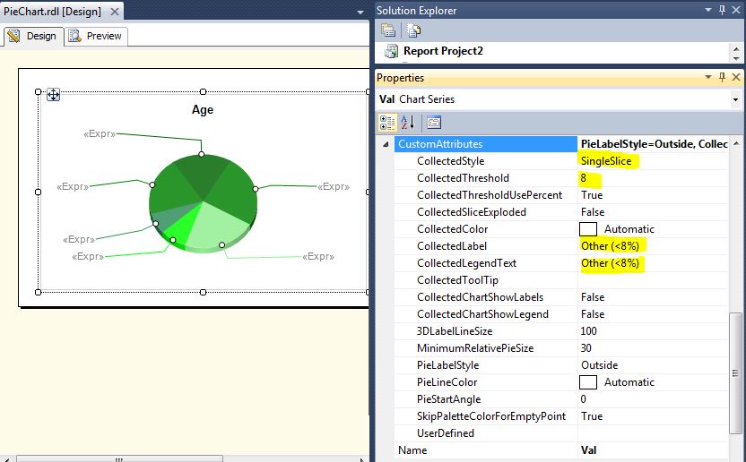
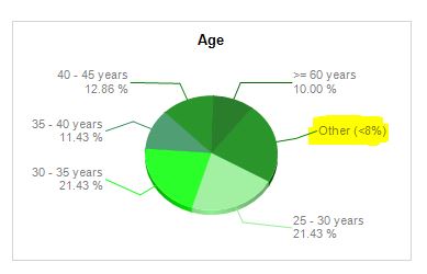
Tips 3: Limiting the Pies


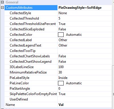
In CustomAttributes set
  • CollectedStyle = SingleSlice :- (No of Pie)
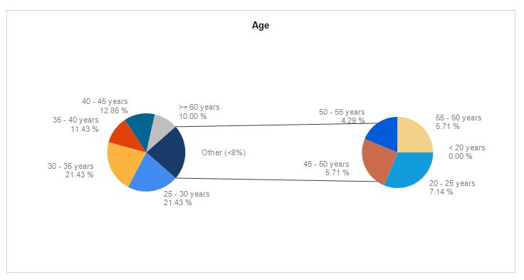
  • CollectedThreshold = 8 (this mean that any slice smaller than 8% of the pie will       be added into the “ColectedSlice”)
  • CollectedLable = Others (8%)
  • CollectedLabelText = Others (8%)


Note: If you want to shows the details of CollectedPie (others) in other pie chart:

Under CostomAttributes:
  • CollectedChartShowLabels = True
  • CollectedChartShowlegend = True


Tips 4: Rotating the Pie or Changing Starting angle of pie


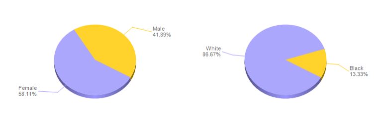
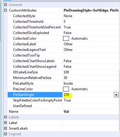
By default the angle strat at 30 Degree (4:00 O’Clock) even PieStartAngle shows as O.


Set the PieStartAngle = 270 Degree ( 12:00 O’Clock), Display will be as shown below


Cheers!

Monday, November 4, 2013

Custom coloring / palette in Pie chart - SSRS 2012

This post is about how to make our own custom color palette in SSRS Pie chart


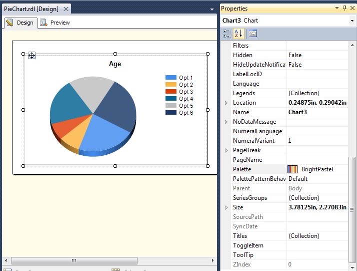
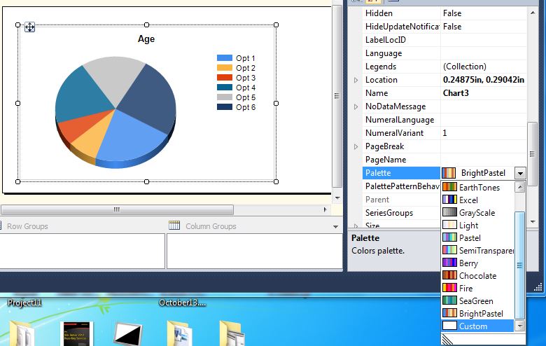
By default the pie chart color palette is set to “BrightPastel”, We can also change color palette as we want with default color palette. The following images illustrates this:


If we don’t like any of these default color palette, we can create custom color palette as per the customer perspective.


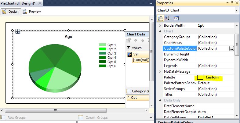
Step 1: Click on “Palette” and select the “Custom”


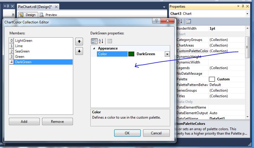
Step 2: Click on “CustomPaletteColor” and add the color set as you want:


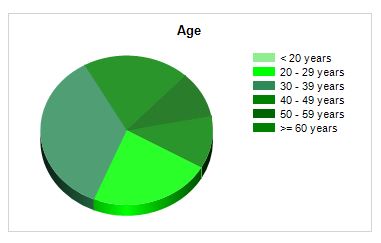
One you make this Pie chart will display the colors as you want


Cheers!

Remove unwanted white space in SSRS report

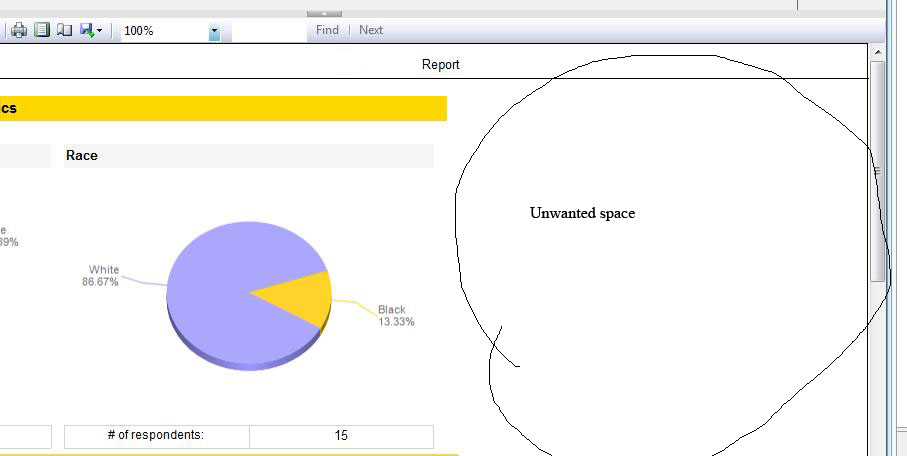
On the Report there is a property "ConsumeContainerWhitespace" which is by default set to false. After setting this to true, unwanted white space will be removed automatically.


1.    While "ConsumeContainerWhitespace" is false


2. Change the properties to True


3. Once make it true, unwanted white space will be removed.


Cheers!
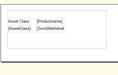
Control Number of Column dynamically in Matrix Report

In this post, I am going to explain the how to control the number of column per in the matrix dynamically. Even though this is not my own finding, this concept may be very useful for many of us. This blog is written based the many post that already available in the internet.


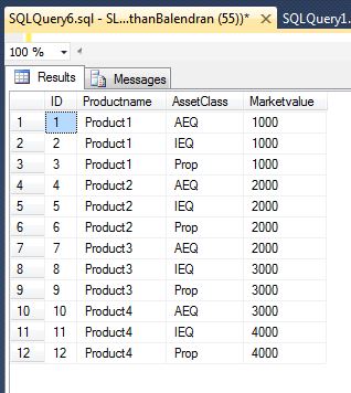
Data set that I used here is:


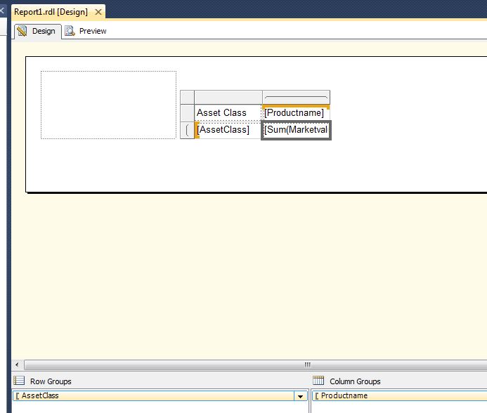
If matrix report, if we design as below, display will be as following:
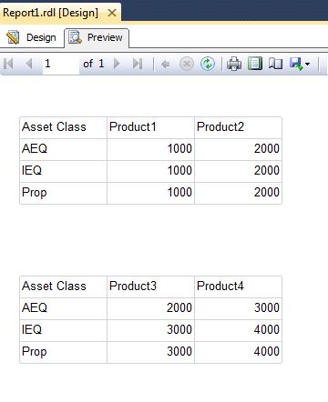
But, the requirement was, there should be 2 product per row, i.e., preview should be as below:
To do this there is no any in build function, so I have found the following method to do from some posted blogs by the genius.


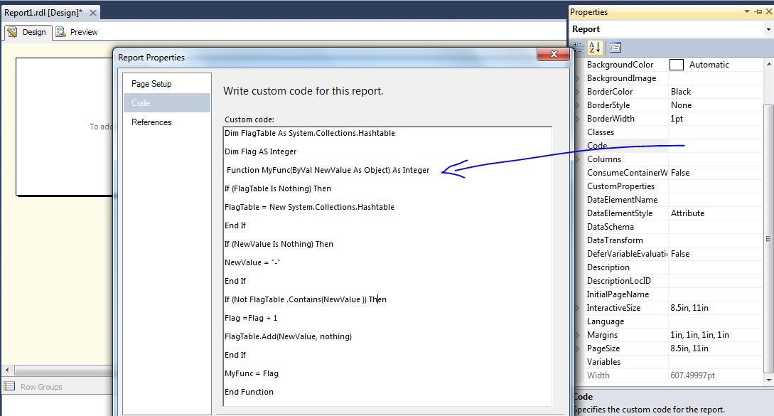
Step 1: Create the custom function: copy the following code to the custom code area.


You can copy and paste the below code:
Dim FlagTable As System.Collections.Hashtable
Dim Flag AS Integer
Function MyFunc(ByVal NewValue As Object) As Integer
If (FlagTable Is Nothing) Then
FlagTable = New System.Collections.Hashtable
End If
If (NewValue Is Nothing) Then
NewValue = "-"
End If
If (Not FlagTable .Contains(NewValue )) Then
Flag =Flag + 1
FlagTable.Add(NewValue, nothing)
End If
MyFunc = Flag
End Function


Step 2: Add a list to your report.
1.      Right-click the list,and then select Properties.
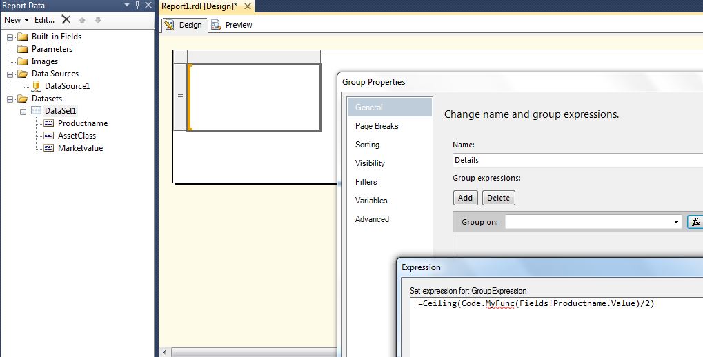
2.      Click Edit details group… button
3.      Type in the expression =Ceiling(Code.MyFunc(Fields!Productname.Value)/2)


Note:
1) Fields!Productname.Value is your column group data field
2) 2 is the number of the columns you want to display in a row
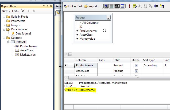
Step 3: Sort the data set by column group field, and then drag the matrix into the list
The following image shows the data set:


The following image shows the matrix which create the outside the list.


Step 4: Drag the matrix into the list and preview the report. Then preview it will be display as you want.


Cheers!


Tuesday, October 29, 2013

Introduction to Group for Tablix (Matrix and Table) - Part 3

This post is about how to convert Table into Matrix


One of the key differences between a tablix structured as a table and a tablix structured as a matrix is the Details group. A table usually (but not always) includes the Details group, whereas the matrix eliminates the Details group to display aggregated values only. Therefore, it's necessary to manually remove the detail group from the report to convert the report layout from a table to a matrix.


Drag and drop the Data column into relevant Row/Column Group


Delete the Details Row Group, and then delete the irrelevant headers.


This will shows as below same as matrix:

Cheers!

Introduction to Group for Tablix (Matrix and Table) - Part 2

The post is about the Row and Column grouping using matrix:


1. Add the matrix: Select CalenderYear under Row and the SlaesTerriteryGroup under Column and Sales amount under Data.
The  preview will be as below:


If you want to add more Row group or column group follow the below steps:
The preview will be as below:


We also can swap the column and row group data:
The preview will be as below:


Cheers!


Introduction to Group for Tablix (Matrix and Table) - Part 1

This post is about the basic features of Tablix grouping in SSRS.

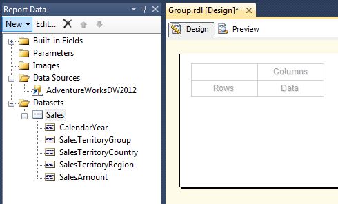
Data set and the query that I have used is following:


The following steps illustrates how to create the Grouping:

1. Drag and Drop the matrix

2. Under “Rows” select the CalenderYear and then Under Data select the SalesAmount.


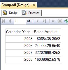
3. Preview will as below:


There are two kind of grouping:
1.       Parent child grouping
2.       Adjacent Before/After grouping


The following images illustrated how the parent child grouping will work:


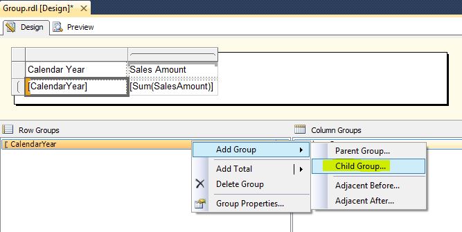
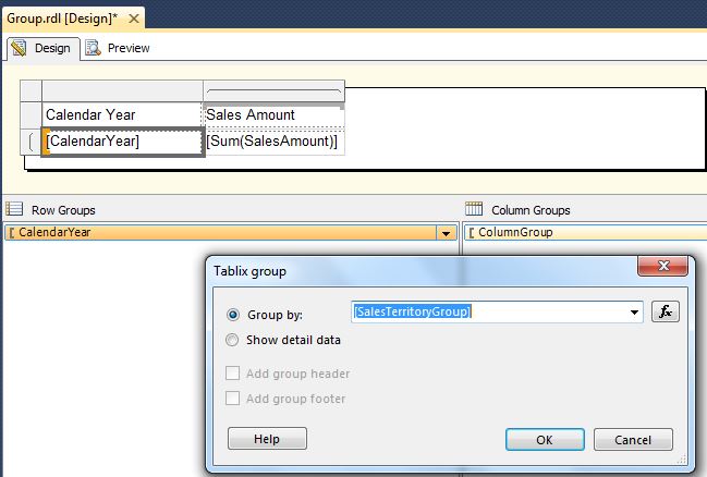
1. For the previous report, right click on the CalenderYear and select child group under Row group pane:


2. Select SalesTeritoryGroup


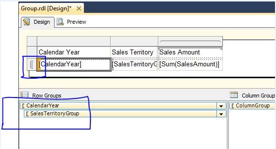
3. The design view will be look like beow:


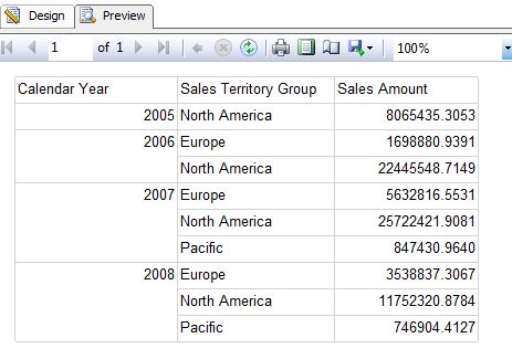
4. The preview will be as below:
The following images illustrated how the Adjacent grouping will work:


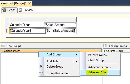
1. Add Adjacent After for Calendar year


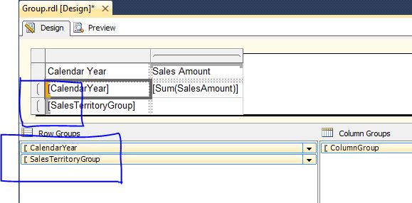
2. The design view will be as below:


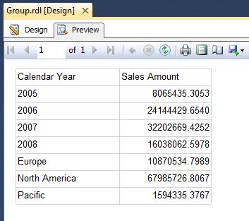
3. Add the sales amount against SalesTerriteryGroup.
4. The preview will be as below:


The following Images show adding total for Parent Child Group:


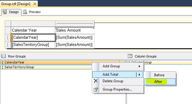
The following Images show adding total for Adjacent Group:


Cheers!