Azure Analysis service is available now for business and users can connect to the SSAS Tabular model using analytical tools such as Power BI, Excel etc.
-
Model and shape virtually any data of any size
-
Provide secured access, anytime from virtually anywhere
-
Visualize your data using your favorite data visualization tool
-
Get started quickly without the need to manage infrastructure
-
Scale resources to match your business needs
-
Govern, deploy, test and deliver your BI solution with confidence
Currently available pricing tiers:
 Step1: Create Azure Analysis Service

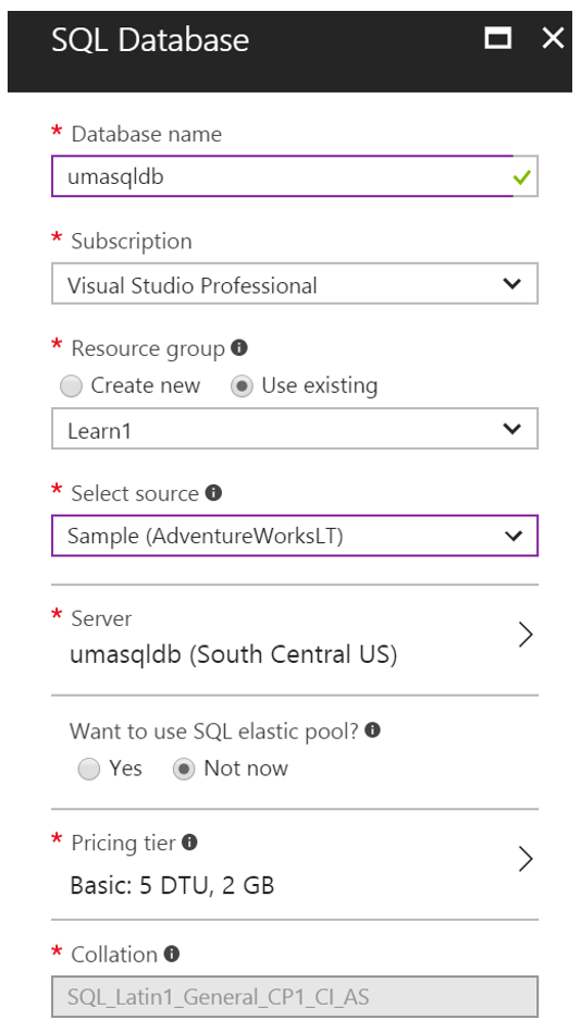
 Step2: Create an Azure SQL DB
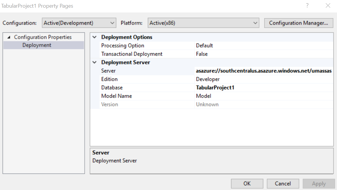
 Step3: Connect Azure Analysis Service using Visual Studio


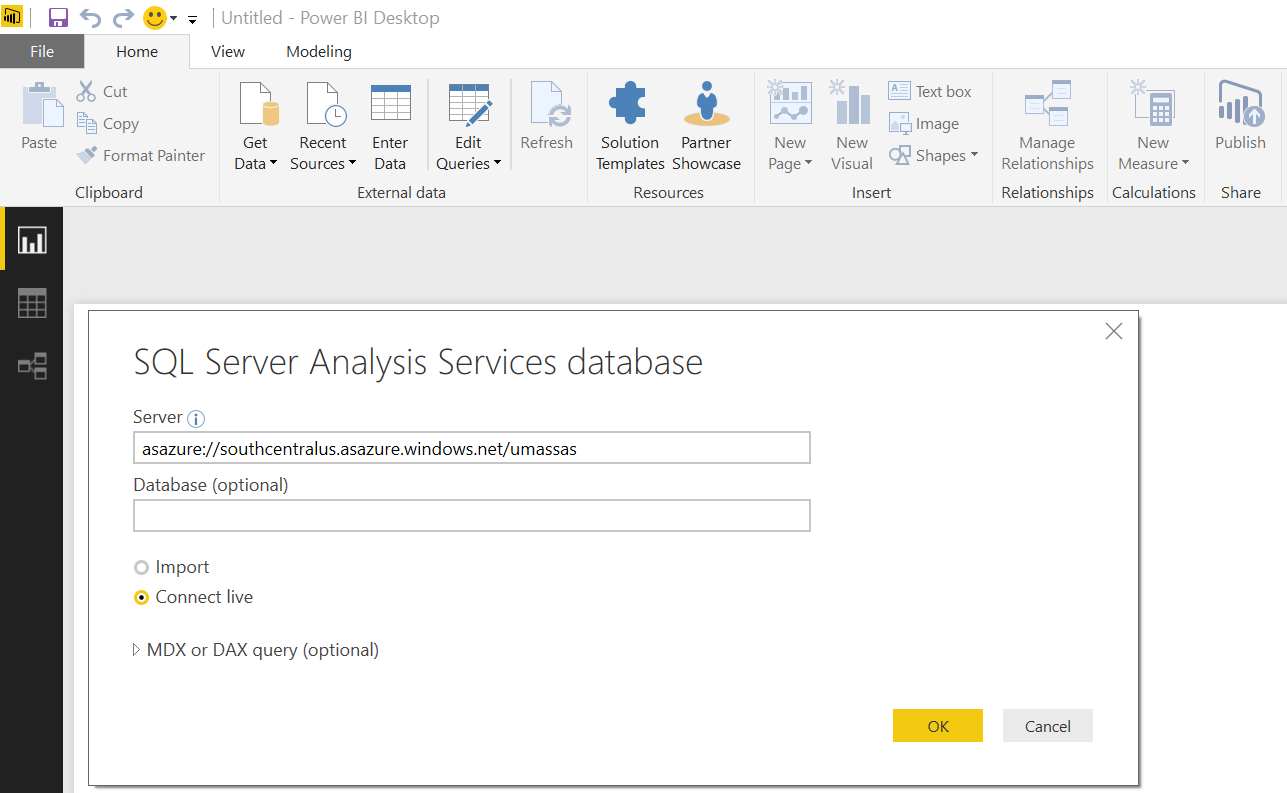
 Step4: Select Databases/SQL Server Analysis Services and then connect
 Cheers!
Uma
Model and shape virtually any data of any size
Provide secured access, anytime from virtually anywhere
Visualize your data using your favorite data visualization tool
Get started quickly without the need to manage infrastructure
Scale resources to match your business needs
Govern, deploy, test and deliver your BI solution with confidence
Thanks for sharing this Informative content. Well explained. Got to learn new things from your Blog onPower BI Online course
ReplyDeleteThis comment has been removed by the author.
ReplyDeleteNice post My sincere thanks for sharing this post Please Continue to share this post.
ReplyDeleteMS Power BI Training in Hyderabad
Never too late to start learning at Salesforce Training in Australia even though you don't have any programming knowledge you can excell in Salesforce Training in London United Kingdom (UK) because it is all about your customers, so this time find the best Salesforce Training in Europe. This way we will learn Salesforce CRM.
ReplyDeleteThe treemap Data Visualization Service is a way to use color, size, and context to show hierarchical data. The treemap shows the data in a rectangular area, where the rectangles are arranged inside the area to form a tree structure. The area of each rectangle depends on some data value of the item it represents. The color of each rectangle corresponds to a value. Size of the rectangles is also dependent on value.
ReplyDeleteI think you might also need the help of another important aspect of Power BI about which I am referring in this post.
ReplyDeletePowerbi Read Rest